|
BIOL 3110
Biostatistics Phil Ganter 301 Harned Hall 963-5782 |
Eulychina castanea fruit |
|
BIOL 3110
Biostatistics Phil Ganter 301 Harned Hall 963-5782 |
Eulychina castanea fruit |
The Normal Distribution
Back to:
Academic
Page |
Tennessee
State Home page |
Bio
311 Page |
Ganter
home page |
Unit Organization: This chapter focuses on the most often used probability distribution, the normal, and introduces probability density functions, the idea of standardization, and testing to see whether or not data agree with the normal curve.
Problems:
Problems for homework
- 4.1, 4.2, 4.3, 4.4, 4.19, 4.36, 4.40, 4.45
Suggested Problems
- 4.7, 4.9, 4.12, 4.17, 4.21
The Normal Curve (=bell curve, = Gaussian Curve)
Perhaps better to call it the Gaussian distribution, as normal here does not mean normal in the usual sense and many normal things do not have a normal distribution.
The normal curve is expected when variation from the mean is due to some random influence. If you measure the length same thing with the dame ruler, you might get a cluster of close values with the differences caused by a variety of errors. If the errors are random, the lengths should be distributed normally
The great utility of the normal does not come from its occurrence in nature. It comes from the fact that sample statistics differ from population parameters and that the differences are normally distributed. Many statistical tests are based on the normality of the difference between sample and population
x-axis is the random variable under consideration
y-axis is the frequency with which a particular value of the variable occurs or the probability of getting that particular value of x
For the normal distribution, the mean = median = mode (the most probable value).
the distribution is Symmetric about the mean (a curve that is not symmetric is said to be Skewed to the left or the right)
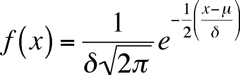
The normal frequencies (Densities in the book) can be calculated from the following equation
= population mean,
= population standard deviation
x = value of random variable, e = base of natural logarithms = 2.71...
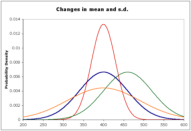
Notice that we are using population parameters, not sample statistics, so Greek symbols are used. If you look at the graph, you can tell that the values of x chosen for calculating the graph were between 200 and 600.
Also Notice that the left-hand side is not y, as you might be used to. f(x) means the value of the function of x, which is what y is, so the two are just different ways of writing the same thing. The f(x) values are graphed on the y axis and are the probabilities of x
Inflection points
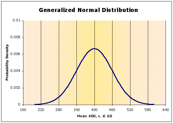
the shape of the curve depends on the standard deviation, it is flatter when s.d. is large, peaked when s.d. is small (compared to the mean)
In the diagram below, the blue curve is the normal with a mean of 400 and a standard deviation of 60, as above
the red curve has the same mean, but a smaller st. dev (= 30) - notice it is sharper than the blue. Why is that?
the orange curve has the same mean, but a larger st. dev. (= 90) - notice that it is flatter than the blue. Why?
the green curve has a different mean (= 460) but the same st. dev. Compare its shape to the blue curve.
The area under the curve represents probabilities.
if x can range from -infinity to infinity, then the area represents the probability of all possible values of x, which must be equal to 1
Imagine a vertical line going from the x-axis to the peak at the curve at 400
this would divide the curve into two equal halves (remember it is symmetric)
this means half of the curve is less than 400, or the probability of being below the mean is 0.5
the same can be said for the probability of being above the mean
Areas under a normal curve
Z-ifying or Standardization of a symmetric curve
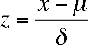
z is a new variable, calculated from the old (x) that allows you to compare symmetric distributions with different means and standard deviations (in terms of x)
Standard areas under a normal curve expressed as z values
- 1z to 1z = ~68% of area under curve (68 % of all observed x values)
- 2z to 2z = ~95% of area under curve (95 % of all observed x values)
- 3z to 3z = ~99% of area under curve (99 % of all observed x values)
Finding standard areas when the z value is not 1, 2, or 3
First calculate the z value
Use the table of z values which list the area under the curve from - to the z value.
Combine these areas to find the area you need.
If we have a data set, can we determine if the data points are scattered in a normal fashion? Yes, we can, although it becomes more difficult as the sample size gets smaller. This is just when you really need the test (is seems we don't live in a perfect world)! In fact, there are several ways to test for normality. The book presents a Normal Probability Plot, which is discussed below. The plotting method in the book is a bit different from those with which I have worked, but it illustrates normality very well.
Normal Probability Plots
The book's approach starts by asking what the z-values should be for the n observations in a data set, if the data were distributed according to the normal curve.
To get these values, you have to take each data point and go backwards. Normally you use the data point and get the z-value (using the mean and standard deviation). The book's approach is to say, for example, if the observation is the fifth of twenty observations (ordered from smallest to largest), then what should its z value be (depending on the mean and standard deviation). This is called, in the textbook, the "normal score" for that observation. The NORMSINV function of MS Excel will give you this score. In order to do it, you have to calculate the cumulative probability for that point, which is not discussed in the book. It is this cumulative percentage that determines the appropriate "normal score." If the data point is right in the middle of the scores, it should be the mean value (for normally distributed data) and so it get a "normal score" for the 50%. If the data point's cumulative percentage is 97.5%, it should be 2 standard deviations above the mean value, which becomes its "normal score" (remember that 2.5% of the normal curve is in the upper tail past +2 s. d.).
Reading the Book - The book plots the normal scores of each data point versus the value of the data point. The book says "we find all 11 normal scores and match them with the 11 data values" (page 136, second paragraph). Notice that the first six plots (Figure 4.26) come from computer-generated data and have been turned into z-scores, so the y-axis goes from about -2 to + 1. However, figures 4.27 to 4.30 have the real data on the y-axis.
A deviation from a straight line on the plot indicates that the data is not normal (see below).
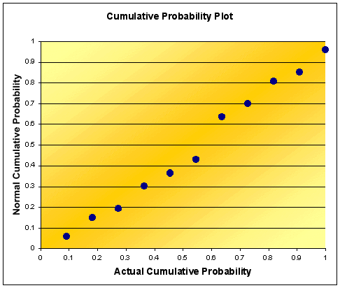
Cumulative Probability Plots
Here is an alternative plotting technique. It generates plots that are similar to the Normal Probability Plot but are easier to do if you use the table in the back of the book.
Calculate the mean and s.d. of the data and use this to z-ify each data point
Calculate the actual cumulative probability
This is easy to do. First, order your data from smallest to largest in a single column
Make a new column and into each column enter 1/n (n = sample size). This is the proportion of the total each data point represents (all are the same, even if their actual values vary by a large amount)
The first cumulative value is just 1/n, as the first data point represents just that much of the data.
To get the next cumulative value, add the new data point's value individual value (= 1/n) to the previous cumulative value. The last data point should then have a cumulative probability of 1.0
Calculate the predicted normal probability
If you use MSExcel, then this is easy to do. For each Z value, use the NORMSDIST( ) function. It returns the cumulative probability.
Alternatively, use the table at the end of the textbook to get the cumulative values (the area from negative infinity to the z value of interest).
plot the actual cumulative probabilities (y-axis) versus the predicted normal cumulative probabilities (x-axis).
If the data is distributed normally, the plot will be a straight line.
If there is a plateau (flat on the x-axis) in the middle, then there are too many data points near the extremes (platykurtic)
If there is a cliff (flat on the y-axis) in the middle, then there are too few data points near the extremes (leptokurtic)
skew will produce parabolic curves
For the data in the book (61, 62.5, 63, 64, 64.5, 65, 66.5, 67, 68, 68.5, 70.5) the plot of cumulative probabilities will look like this (notice the labels on the axes). Note that it is very similar to the one in the book and easier to do.
An alternative test is based on the cumulative probabilities of the actual data versus that of a normal curve with the same mean and standard deviation. You calculate both for each data point or data class if you are reading from a frequency table and subtract the actual cumulative probability from the expected cumulative probability. One can then judge normality based on the largest absolute value of the differences tested with table published by Stevens (Stephens, M. A. 1974. EDF statistics for goodness of fit and some comparisons. Journal of the American Statistical Association, 69:730-737)
Becoming Normal
if the data are obviously not normal and you wish them to be, then a non-linear data transformation can sometimes correct the original data points.
For discrete variables (where the frequency distribution will be a histogram, not a smooth curve), there will be a discrepancy between probabilities gotten from summing up the areas represented by the bars and getting the area under a smooth curve
one should subtract a half unit from lower limit and add a half unit to upper limit before calculating the z values
units here refers to the units of the original data, the x values, and not the z values
need to do this as the discrete values represent columns on a histogram, with the unit value at the center of the column
Last updated August 23, 2006